
Please rotate your phone.
This experience is designed for portrait mode.
CASE STUDY · ALBERTSONS COMPANIES, INC.
Unified Design System
Founded a company-mandated design system and agentic AI platform that unified Merch UX and accelerated delivery across Albertsons.
SCROLL
Role
Director, UX Product Design & Innovation — Design System Owner. Established UDS as an internal product platform with shared design + engineering foundations, not just a Figma library. Drove multi-POD adoption through reusable components, templates, governance, and documentation.
Mandate
Modernize Merchandising UX, reduce tech debt, and give all PODs a single standard for UI, accessibility, and performance — while building a blueprint designed to scale across the broader Albertsons ecosystem.
Key Outcomes
- Shifted UDS from an optional library to the default build path for Merch POD delivery.
- Established governance, documentation, and QA/audit practices to protect consistency as the system scaled.
- Used V1 adoption learnings to define the V2 modernization backlog (parity, tokens, responsiveness, AI-ready foundations).
- 76% reduction in supplier onboarding SLA (21 → 5 days), 23% error reduction, +15 NPS when applied to the Merchant & Supplier Portal.
Fragmented POD front-ends drove tech debt, inconsistent UX, and costly rebuilds.
Before UDS, Merch experiences were built across varied stacks, patterns, and UI approaches. This fragmentation created inconsistent user experiences, increased maintenance costs, and forced teams into repeated rebuild cycles for features that should have been reusable.
- Inconsistent UI patterns across PODs increased tech debt and rework.
- Limited reuse created longer cycles for common workflows.
- Fragmented documentation and standards increased onboarding friction.
- Lack of shared foundations reduced confidence in cross-team consistency.
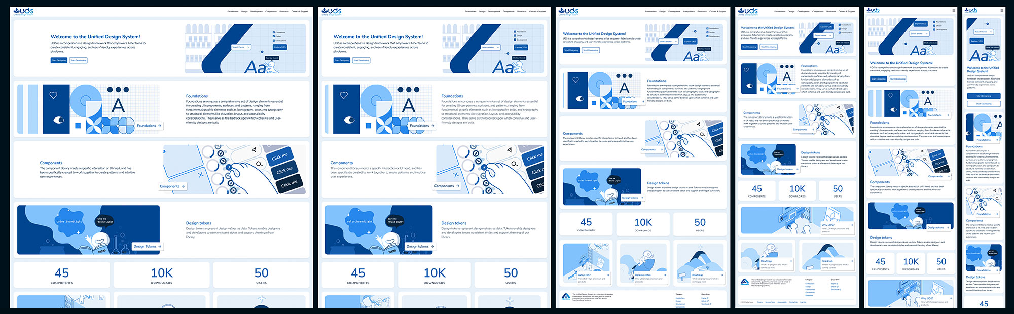
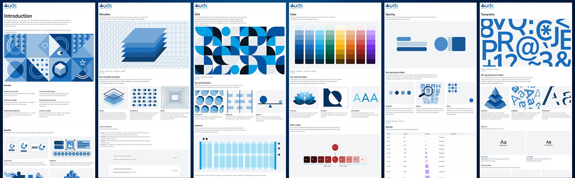
UDS In Production — Platform Screenshots
UDS Governance & Component Lifecycle
This diagram illustrates the full component governance model and lifecycle used to operate UDS at scale — from initial team request and RFC through UX and accessibility review, engineering implementation, QA sign-off, versioned release, usage telemetry, and eventual deprecation. It served as the operating backbone for the Design System Council, providing a shared language and structured intake process across all Merchandising PODs.

BEFORE 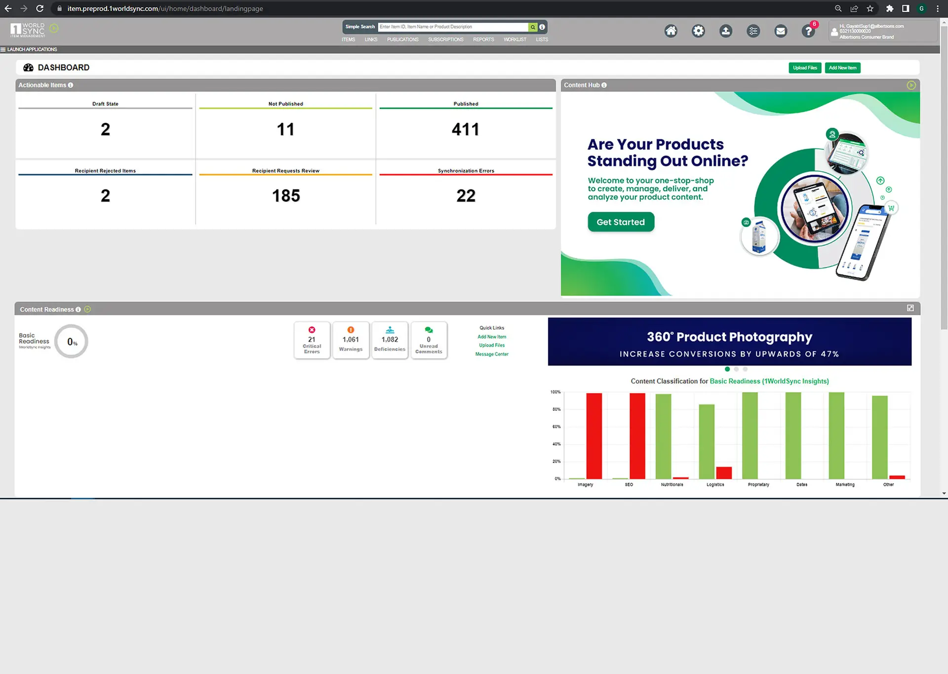
AFTER 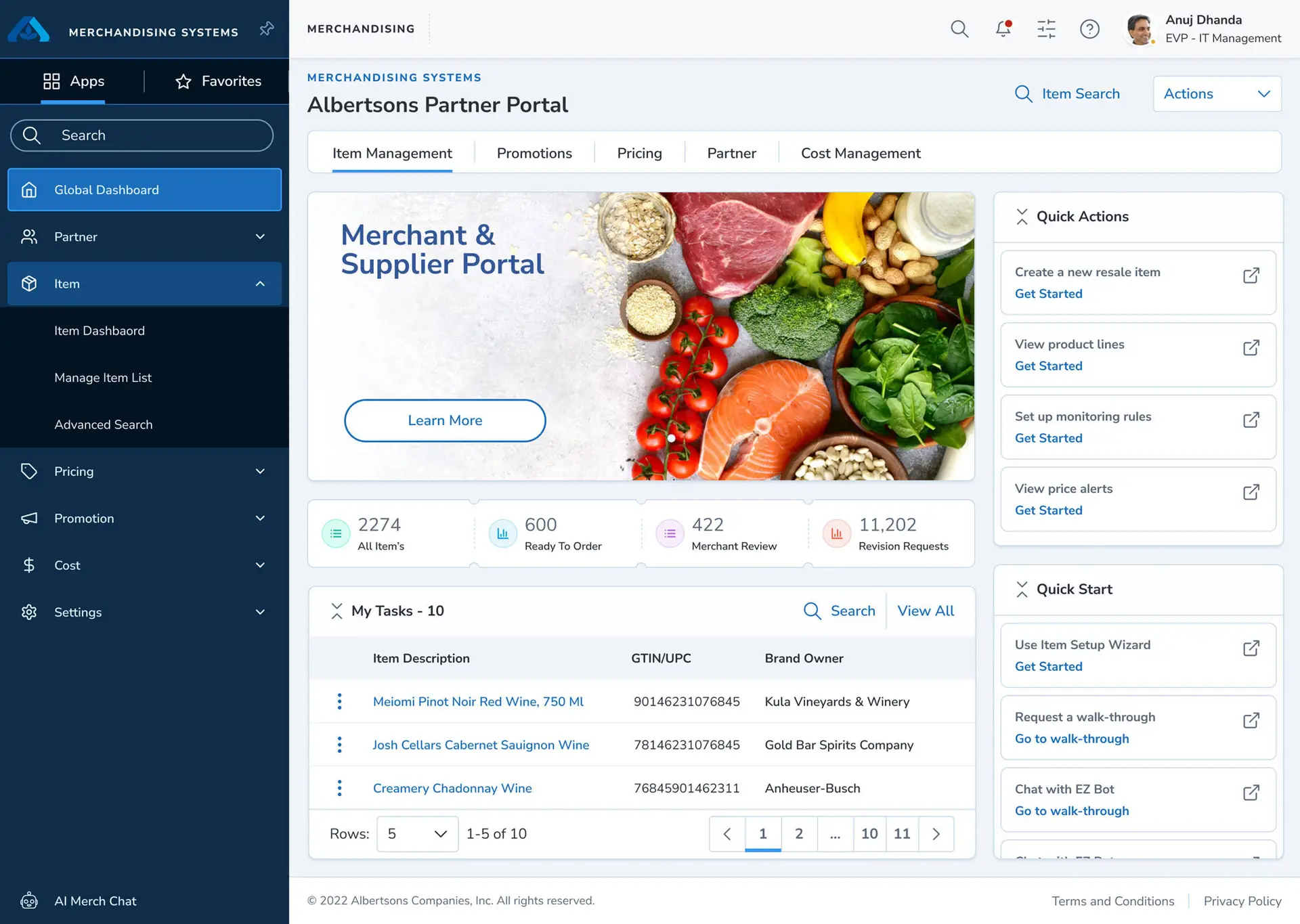
Scope, Delivery & Governance
Operating Model
- Owned the Merch UX platform operating model for UDS across PODs, including intake, prioritization, stage gates, OKRs, and value-realization reporting.
- Led a 25+ person cross-functional delivery model spanning Product Design, UX Systems, Research, Front-end/Back-end Engineering, Data Science/Analytics, Product Management, and Scrum; instituted a unified cadence across PODs.
- Secured executive alignment and long-range capital planning; maintained a self-funded model through an internal chargeback approach.
- Chaired the Design System Council and cross-business working groups for tokens, governance, and accessibility to ensure scalable standards and consistent adoption.
Strategy & Architecture
Foundations & Standards
- Standardized foundations across color, typography, spacing, grid behaviors, icons, shadow, elevation, motion, shape, and layout rules.
- Enabled consistent component construction using shared foundation logic.
- Reinforced design-to-dev clarity through documented usage patterns.
- Positioned foundations as the backbone for scalable templates and feature growth.
Tokens, Themes & Agentic AI
- Implemented a design tokens pipeline using Tokens Studio + Style Dictionary, wiring tokens into the code architecture to support scalable theming and reduce design-to-dev drift.
- Built an agentic AI-assisted design-to-code pipeline (Locofy + Cursor): Figma tokens → React/Storybook components → versioned packages with unit & visual regression tests; reduced design-to-dev handoff time by ~35% and PR rework by ~18%.
- Introduced AI-enabled acceleration patterns to increase consistency and speed for token-compliant UI assembly across POD teams.
Components & Templates
- Built reusable components derived from standardized foundations.
- Organized the library in a scalable hierarchy: foundations → primitives → compound components → templates.
- Established a component-first model to replace pod-specific UI solutions.
- Delivered product templates for core enterprise patterns (full-width content, forms with right rail, calendars, dashboards).
- Reduced rework by narrowing the gap between Figma intent and production behaviors.
UDS Token & Component Grid — Full System Scale
Governance & Audit
UDS was managed as a living product with structured governance to prevent bloat, protect UX consistency, and prioritize high-impact POD needs. Quality was reinforced through repeatable audit standards that validated parity across design intent, implementation, and cross-browser performance.
- Formalized a component lifecycle: request/RFC → UX/accessibility review → dev implementation → QA checks → release → telemetry and deprecation.
- Prioritized POD requests based on business impact and sprint capacity.
- Maintained a future-focused backlog to keep foundations ahead of 'nice-to-haves.'
- Defined audit checklists across typography, layout/spacing, color systems, form behaviors, icons/images, and micro-interactions.
- Published the UDS Documentation Website as the single front door for standards, usage patterns, and release updates — reducing onboarding friction and enabling more self-serve adoption.
Typography Layout & Spacing Colors Form Elements Images & Icons Micro-interactions Animations Storybook Figma Confluence Release Notes
UDS Governance & Component Lifecycle Diagram
This diagram maps the full lifecycle of a UDS component — from team request and RFC through UX review, accessibility validation, engineering implementation, QA sign-off, versioned release, and eventual deprecation. It was the operating backbone used by the Design System Council to manage intake, prioritize work across PODs, and ensure every component met quality and governance standards before reaching production.

Adoption, Roadmap & Organizational Impact
With v1 adoption proving value in production, the roadmap shifted toward formalizing the next generation of UDS foundations and expanding the system's enterprise readiness. The strategy prioritized high-impact components, theming improvements, a stronger documentation platform, and a demo path that made adoption easier and more self-serve.
UDS Core Components UDS 2.x Themes Update UDS Website UDS Demo App
Defined a prioritization model across MSP PODs, Collective Hub needs, and the UDS backlog to keep high-impact work ahead of 'nice-to-haves.'
Positioned UDS as Merchandising's core UI/UX resource and articulated the business case for design systems (consistency, efficiency, cost control, and scalable delivery).
Merchant & Supplier Portal — Flagship Use Case
Before UDS
Fragmented supplier workflows across SharePoint, email, and legacy tools triggered long onboarding SLAs and manual rework.
After UDS
MSP rebuilt on UDS templates and components — global navigation, data-dense dashboards, task lists, and workflows sharing the same grid, patterns, and foundations.
76% SLA reduction (21 → 5 days)
23% error reduction
+15 NPS improvement
MSP became the proof-point used to secure continued investment and expand adoption into additional PODs.